Luxury Nordic Wall Clock: A Calm, Modern Living Room Anchor
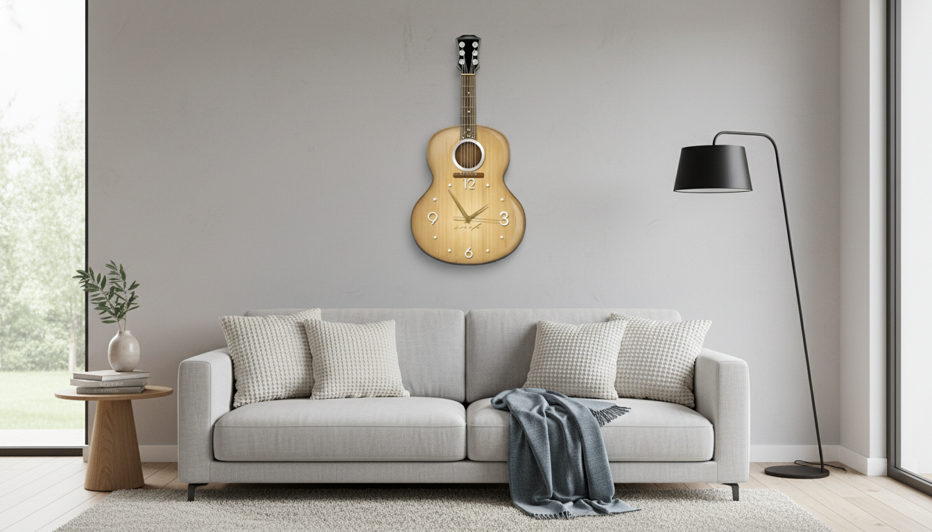
Luxury Nordic Wall Clock for a Calm, Gallery-Worthy Living Room
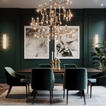
A large wall clock can do more than tell time—it can anchor a room, balance a wall, and bring a sense of quiet order to everyday life. This luxury Nordic-style wall clock is designed to read clearly from across the living room while adding an elevated, minimalist decorative presence that suits modern, Scandinavian, and contemporary interiors.
What Makes a Nordic-Inspired Wall Clock Feel Luxurious
Nordic-inspired decor is often associated with simplicity, but “simple” doesn’t mean basic. A wall clock feels truly luxurious when every visual choice looks deliberate—proportions, contrast, and restraint working together instead of competing for attention.
- Clean geometry and restrained detailing that complements other decor instead of competing with it
- A larger silhouette that reads as wall decor first and a timepiece second
- A neutral, calming aesthetic that works with light woods, stone textures, and soft textiles
- A refined look that suits both bright, airy spaces and moodier modern living rooms
Scandinavian design has long emphasized functionality paired with clarity and minimal ornamentation—an approach that translates naturally into statement clocks that still feel calm. For a quick overview of the movement’s principles, see Encyclopaedia Britannica’s entry on Scandinavian design.
Where It Looks Best in a Living Room
The best placement creates a “finished” feeling—like the clock belongs to the architecture of the room rather than filling an afterthought gap. A large clock also helps guide the eye across the wall in a clean, organized way.
- Above a sofa: centers the seating area and helps the wall feel intentional rather than empty
- Over a console or sideboard: pairs well with a vase, lamp, or stacked books for a balanced vignette
- Near an entry point: creates a practical “time check” zone while reinforcing a polished first impression
- On a large blank wall: adds scale and structure without needing multiple frames or shelves
| Placement | Quick sizing rule | Styling note |
|---|---|---|
| Above sofa | Clock width ~ 1/3 to 2/3 of sofa width | Keep the bottom edge visually aligned with nearby art or a floor lamp shade line |
| Above console | Clock width ~ 1/2 to 3/4 of console width | Repeat one material tone (wood/metal) in decor objects for cohesion |
| Standalone wall | Bigger walls need a larger clock | Use as a focal point; keep nearby decor minimal to maintain the calm Nordic feel |
Choosing the Right Scale and Visual Weight
“Large” doesn’t automatically mean “heavy.” The goal is to add presence without making the wall feel crowded. A clock’s visual weight comes from its frame thickness, color contrast, and how much negative space (open area) it leaves around the face.
- Large clocks help rooms with high ceilings feel grounded and finished
- Thin frames and open negative space feel lighter; thicker silhouettes read bolder and more sculptural
- The clock should be readable from common seating positions without feeling oversized up close
- If the room already has a dominant focal point (fireplace, TV wall), the clock should echo the palette rather than introduce a new one
For rooms where the TV is already the main focal point, a Nordic clock works best slightly off-center—near a bookshelf, above a sideboard, or on an adjacent wall—so it adds structure without creating visual competition.
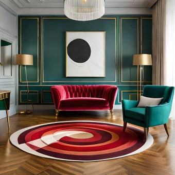
Aesthetic Pairings That Make It Look Intentional
A statement wall clock looks most elevated when it feels “designed in” with the rest of the room. The simplest way to do that is to repeat a finish or tone (matte black, warm metal, light oak) in two other small places in the space.
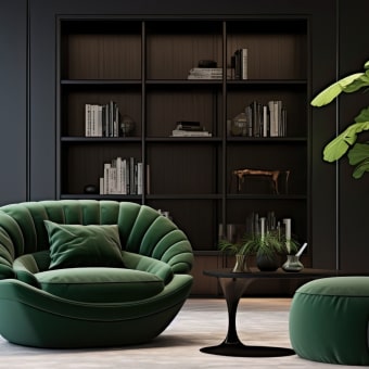
- Scandi minimal: light wood tones, off-white walls, linen textures, and one or two matte black accents
- Modern luxe: warm neutrals, brass or gold accents, soft curves, and layered lighting
- Japandi calm: muted palette, natural fibers, low visual clutter, and emphasis on negative space
- Monochrome contemporary: tonal blacks/greys with a single natural element (oak, stone, or greenery)
Practical Details That Matter Day-to-Day
For anyone curious about how time is measured and maintained at the highest standards, the National Institute of Standards and Technology (NIST) Time and Frequency resources offer a helpful background—an interesting reminder of why accurate timekeeping still matters, even when the clock is also a design object.
Installation Tips for a Clean, Secure Finish
Care and Styling Longevity
The Featured Clock
- Luxury Nordic Wall Clock – Large Aesthetic Decorative Wall Clock for Living Room
- Designed to function as a statement decor piece while staying visually calm and minimalist
- Works well as a single focal point or as an anchor within a curated wall arrangement
- Suitable for living rooms that need scale, clarity, and a refined modern finish
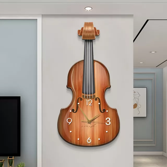
More In-Store Picks
- SG109 Max 2 4K FPV Camera Drone with 3-Axis Gimbal & Obstacle Avoidance
- How to Value Your Car Like a Pro Before Selling or Trading – Ultimate Guide to Car Valuation for Sale or Trade-In
FAQ
How high should a large wall clock be hung in a living room?
Aim for comfortable viewing from the main seating area, typically near eye level. If it’s above a sofa or console, hang it a bit higher so the spacing looks balanced and the clock doesn’t feel cramped by furniture.
Will a large decorative wall clock overwhelm a small living room?
It can still work when the design feels visually light (thin frame, clean face) and the surrounding wall is kept minimal. Focus on proportion to nearby furniture and preserve negative space so the room stays open.
How can a wall clock look like decor instead of an afterthought?
Repeat one or two finishes already in the room (like matte black or warm metal), and center the clock with the furniture below it. Keep nearby accessories intentional and restrained so the clock reads like a planned focal point.


Leave a comment