AI Logo Ideas Guide: Fast Workflow + Quality Checklist
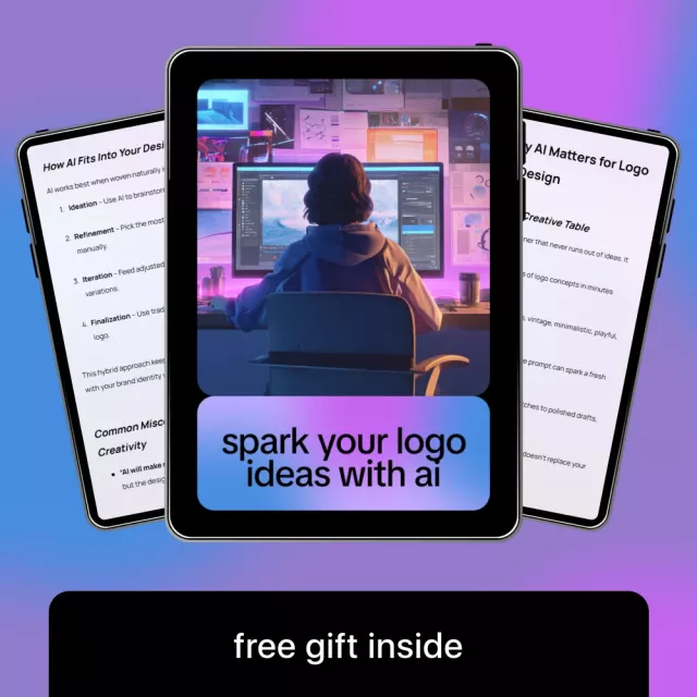
Spark Your Logo Ideas with AI: A Practical Digital Guide for Faster, Stronger Branding
Strong logos balance clarity, meaning, and versatility. AI can speed up the messy middle of logo creation—exploring concepts, remixing directions, and iterating layouts—but the best results still come from a grounded process: define what your brand stands for, generate multiple routes, refine with intent, and validate the final mark in real-world contexts. This digital guide pairs AI exploration with a practical branding workflow and a quality-control checklist so quick ideas turn into a logo system that holds up everywhere you use it.
What this digital guide helps accomplish
- Move from vague inspiration to clear logo directions using structured brand inputs.
- Generate multiple visual routes quickly, then narrow them using practical criteria.
- Avoid common pitfalls like over-detailing, poor legibility, and inconsistent styles.
- Build a repeatable workflow for future sub-brands, product lines, or refreshes.
- Use a checklist to validate files, usage rules, and brand consistency.
When AI logo exploration works best (and when it doesn’t)
AI is most useful when you treat it like a high-speed sketch partner. It can surface unexpected shapes, typography pairings, and composition ideas—especially early on, when breadth matters more than precision. Where it tends to fall short is strategy, distinctiveness, and final production polish.
AI logo work: strengths vs. watch-outs
| Stage | AI helps with | Still needs human checks |
|---|---|---|
| Discovery | Mood exploration, style sampling | Brand voice, differentiation |
| Concepting | Many variations fast | Originality, relevance, simplicity |
| Refinement | Quick iterations on layout/color | Spacing, kerning, optical balance |
| Delivery | Draft exports and mockups | Correct formats, usage rules, accessibility |
Two important cautions: First, if your positioning is fuzzy, your results will be generic. Second, AI output can unintentionally resemble existing marks, so you still need a basic similarity and trademark screen. For trustworthy baseline guidance, review WIPO’s trademark basics and the USPTO trademark process and searching.
A practical workflow: from brand inputs to a usable logo system
A logo isn’t just a single file—it’s a small system that must behave consistently across sizes, materials, and backgrounds. A workflow keeps you from over-investing in a weak concept and helps you compare ideas fairly.
- Define brand anchors: audience, promise, personality traits, and the one idea the logo should communicate at a glance.
- Choose a logo type direction: wordmark, lettermark, symbol, combination mark, or emblem.
- Set constraints early: identify where the logo must work (favicon, app icon, packaging, storefront, social avatars).
- Generate variations in batches: explore distinct routes (minimal, geometric, vintage, tech, playful) rather than tiny tweaks on one concept.
- Shortlist with objective criteria: legibility at small sizes, distinct silhouette, and brand fit.
- Refine one direction into a system: primary logo, secondary lockup, icon, monochrome version, and safe-space rules.
When you reach refinement, prioritize vector-first files so your logo stays crisp from tiny icons to large signage. If you need a standards reference for scalable artwork, see the W3C overview of SVG.
Creative branding decisions that make AI outputs feel intentional
What makes a logo feel “designed” is a set of deliberate, consistent decisions—typography, shapes, and color logic that support the brand’s personality and promise. AI can generate options, but you decide what the brand signals.
- Typography choices: pick type that matches tone (trustworthy, modern, friendly) and stays legible across sizes. Watch awkward letter spacing and uneven weight.
- Shape language: round forms often feel approachable; sharp angles can feel energetic or technical. Choose one primary visual “dialect” and stick to it.
- Color strategy: start with 1–2 core colors plus neutrals. Test in grayscale early so the mark doesn’t depend on color to be recognizable.
- Symbol meaning: aim for metaphor tied to the brand promise rather than literal clip-art. A symbol can be simple while still being specific.
- Consistency across touchpoints: align logo style with packaging, web UI, photography, and illustration so the brand feels cohesive, not stitched together.
The AI logo checklist: quality control before you publish
A logo that looks good on a white canvas can fail fast in the real world. Before you commit, run a quick quality pass that covers usability, accessibility, file readiness, and uniqueness.
Pre-launch logo readiness table
| Check | How to test quickly | Pass criteria |
|---|---|---|
| Small-size legibility | Shrink to favicon/app icon size (16–32px) | Readable without blur or clutter |
| One-color version | Convert to pure black/white | Still recognizable and balanced |
| Background flexibility | Place on light/dark/photo mockups | Maintains contrast and clarity |
| Vector integrity | Open/export as SVG/PDF | Clean paths, crisp edges, no pixelation |
| Uniqueness | Search similar marks in your category | No confusingly similar competitors |
Who this guide is best for
Product details and what’s included
The Spark Your Logo Ideas with AI digital guide and checklist is built to be an instant-reference resource you can revisit whenever you need fresh directions, cleaner refinements, or a final readiness check.
Digital guides you may also like
- How to Value Your Car Like a Pro Before Selling or Trading – Ultimate Guide to Car Valuation for Sale or Trade-In
- Calm Paws: Ending Dog Separation Anxiety – Ultimate Guide to Calming Your Dog’s Anxiety with Proven Techniques, Case Studies & AI Prompts
FAQ
Can an AI-generated logo be used for a real business?
Yes, but it should be refined and checked for originality, licensing or usage terms of the tools involved, and potential trademark conflicts before wide use.
What files should a finished logo package include?
At minimum, include a vector master (SVG/PDF/AI), transparent PNGs in multiple sizes, black and white versions, and basic usage rules for spacing and backgrounds.
How do you keep AI logo ideas from looking generic?
Start with specific brand anchors, explore multiple distinct directions, and refine one concept with intentional typography, shape logic, and real-world testing across sizes and backgrounds.


Leave a comment