Seasonal Color Analysis: Find Your Best Shades at Home

Find Your True Colors, Find Your Confidence: A Practical Guide to Color Analysis and Finding Your Season
Color analysis helps identify the hues that naturally harmonize with skin undertone, hair, and eye contrast—making outfits, makeup, and accessories look more balanced with less effort. Instead of chasing “trendy” shades, seasonal color gives a repeatable logic: when the temperature, depth, and intensity of a color echo your natural coloring, your features tend to look clearer and more even. Below is a practical approach to seasonal color, an at-home method to narrow down your season, and simple ways to use a palette while shopping.
What “seasonal color” actually means
Seasonal color analysis groups palettes around three traits that show up in everyone’s coloring:
- Undertone (temperature): warm, cool, or neutral-leaning.
- Value (depth): light to deep.
- Chroma (intensity): soft/muted to bright/clear.
A “season” isn’t about discovering one magic shade that fixes everything. It’s a range of neutrals, accents, and metal tones that share the same overall temperature and intensity. That’s why small shifts matter: a slightly warmer ivory versus stark white, or a softened navy versus inky black can change how even the skin looks and how crisp the eyes appear.
If you want a structured, step-by-step workbook format for testing and shopping with your palette, the digital guide Find Your True Colors, Find Your Confidence – A Practical Guide to Color Analysis How to Find Your Season is a handy way to keep your results organized and consistent.
Start with undertone: warm, cool, or neutral
Undertone is the subtle base tone in skin. It’s not surface redness, a tan, or temporary irritation. Most people’s undertone stays fairly consistent year-round, even when the surface tone deepens in summer.
Because it can be tricky to “see” undertone directly, compare how your face reacts to different references. Use more than one test, and try to do it in indirect daylight (a north-facing window is ideal) with minimal or no makeup.
| Test | Warm-leaning result | Cool-leaning result | Neutral/unclear result |
|---|---|---|---|
| Gold vs silver jewelry | Gold looks harmonious; silver looks sharp | Silver looks harmonious; gold looks yellow | Both look acceptable; neither “wins” |
| Cream vs bright white top | Cream lifts the face; white looks harsh | White looks crisp; cream looks dull | Both are wearable; focus on contrast/chroma next |
| Peach/orange vs fuchsia fabric | Peach/orange makes skin look even | Fuchsia/blue-red makes skin look even | Both cause confusion; try muted vs bright test |
If both warm and cool options look “fine,” you may be neutral or olive-leaning. In that case, don’t force a temperature decision too early—contrast and chroma often clarify the best family.
Then measure contrast: light vs deep and soft vs bright
Contrast describes how different your hair, eyes, and skin appear from each other. Low contrast looks blended and gentle; high contrast looks striking (think light skin with very dark hair, or very bright eyes that pop against the surrounding features).
Value (light vs deep)
Value guides whether light, medium, or deep colors feel most natural near your face. If deep colors overpower you, you may thrive in lighter-to-mid values. If pale colors feel washed out, deeper values may be your friend.
Chroma (soft vs bright)
If you’re documenting tests, quick daylight photos help you spot patterns you might miss in the mirror. If you prefer an easy way to capture consistent outdoor shots (especially for flat-lay outfit checks or color swatches), a stabilized camera setup can help—some shoppers even use tools like the SG109 Max 2 4K FPV Camera Drone with 3-Axis Gimbal & Obstacle Avoidance for bright, true-to-life overhead lighting conditions in open shade.
A simple path to your season (without overthinking it)
| Season family | Temperature | Value range | Chroma | Best neutrals | Metals that often suit |
|---|---|---|---|---|---|
| Spring | Warm/neutral-warm | Light to medium | Bright/clear | Warm beige, camel, warm navy | Gold, champagne |
| Summer | Cool/neutral-cool | Light to medium | Soft/muted | Soft white, dove gray, muted navy | Silver, soft rose gold |
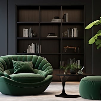
| Autumn | Warm/neutral-warm | Medium to deep | Soft/earthy | Olive, chocolate, warm taupe | Gold, bronze, copper |
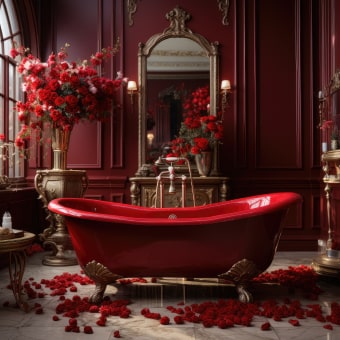
| Winter | Cool/neutral-cool | Medium to deep | Bright/high contrast | Black, bright white, charcoal, cool navy | Silver, white gold |
Make your palette practical: closet, makeup, and accessories
Closet strategy: start with “repeatable” neutrals
Makeup alignment: undertone first, then intensity
Accessories: the fastest way to “fix” a near-miss
Common mistakes that throw off results
For deeper context on how color is described (hue, value, saturation) and why it visually “behaves” the way it does, see Encyclopaedia Britannica’s overview of color and the practical standards used in modern palettes from Pantone. For skin basics and how tone/undertone can present, the American Academy of Dermatology Association is a reliable reference point.
A guided way to lock in your season and shop with confidence
FAQ
Can a season change over time?
Undertone is usually stable, but contrast can shift with tanning, graying hair, or dramatic hair color changes. Those shifts may move you within neighboring seasonal subgroups, even if your core warm/cool direction stays the same.
What if both warm and cool colors seem to work?
That often points to a neutral or olive undertone, where temperature isn’t the strongest deciding factor. In those cases, chroma (soft vs bright) and contrast (low vs high) typically reveal the most flattering direction, and the “best neutrals” and metal test can help you choose a dominant lean.
Do I have to stop wearing colors outside my season?
No—just control placement and styling. Move off-palette colors away from the face (pants, skirts, shoes), use your best metal and a palette-friendly scarf or jacket near the neckline, and tweak makeup so the overall look still matches your season’s temperature and intensity.


Leave a comment